Changes in wellbeing for different population subgroups
Māori
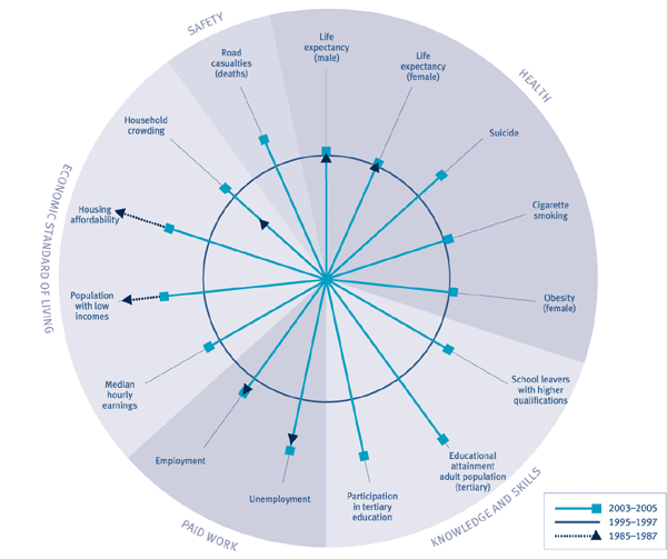
During the period of New Zealand's economic reforms in the 1980s and early-1990s, outcomes for Māori deteriorated or stagnated across many domains. The subsequent improvements in outcomes for Māori have, in many cases, been at a faster rate than for Europeans. However, despite the improvements, average outcomes for Māori still tend to be poorer than average outcomes for Europeans.
Māori life expectancy has increased, with a dramatic improvement in the five years to 2000–2002 following little change during the 1980s and 1990s. Life expectancy for Māori males was 69 years in 2000–2002 compared with 64.9 years in 1985–1987, while that for females was 73.2 years compared with 70.5 years. Obesity has increased among Māori, as it has for all groups since 1989, but there was little change in the rates for Māori between 1997 and 2003.94
Unemployment and employment rates for Māori have also improved. The Māori unemployment rate was 11.3 percent in 1986. It rose steadily to peak at 25.4 percent in 1992, but has been falling since then. It was 8.6 percent in 2005. However, this is still higher than for other ethnic groups. The Māori employment rate fell from 61.2 percent in 1986 to a low of 46 percent in 1992. Since then it has improved, at a faster rate than for Europeans, reaching 64 percent in 2005.
The proportion of Māori families with low incomes rose from 14 percent in 1988 to 42 percent in 1993, but dropped to 24 percent in 2004. The proportion spending more than 30 percent of their income on housing costs increased from 8 percent in 1988 to peak at 36 percent in 1997, fell slightly to 31 percent in 2001, then dropped sharply to 21 percent in 2004. Household crowding has improved since 1986.95
For the remaining indicators, data dates from the 1990s. Suicide rates for Māori have fallen since their peak in 1998, as they have for non-Māori. The percentage of Māori smoking cigarettes has dropped from 51 percent in 1990 to 47 percent in 2004. But Māori still have the highest rates of cigarette smoking of all ethnic groups.96, 97
There has been an increase in the participation of Māori children in early childhood education. While Māori participation is still lower than that for European children, the difference is reducing. The proportion of Māori school leavers with higher qualifications has also increased. Although Māori adults are less likely than European adults to have higher qualifications, the growth in the proportion of adults with at least upper secondary qualifications was faster for Māori than for Europeans. There has also been a sharp increase in Māori participation in tertiary education.
Increases in inflation-adjusted median hourly earnings from wage and salary jobs were higher for Māori over the eight years to June 2005 than they were for any other ethnic group. However, earnings were still $2 an hour lower than those for Europeans. Māori have a higher rate of workplace injury claims than other ethnic groups, reflecting higher Māori representation in more dangerous industries. Māori are also more likely than other ethnic groups to be killed in motor vehicle accidents, though the rate has improved since 1996.
Figure CO2 Changes in social wellbeing for Māori

Interpreting "Changes in social wellbeing for Māori"
The circle  represents average outcomes for Māori against each indicator between 1995 and 1997. The spokes represents average outcomes for Māori against each indicator between 1995 and 1997. The spokes  represent the most recent performance averaged, where possible, over the most recent three years. Where a spoke falls outside the circle, this means outcomes for Māori are better now than they were in the mid-1990s; the further from the circle, the greater the improvement. Where a spoke falls inside the circle, outcomes for Māori are worse now than they were in the mid-1990s; the further the spoke is from the circle the more pronounced this effect. The triangles represent the most recent performance averaged, where possible, over the most recent three years. Where a spoke falls outside the circle, this means outcomes for Māori are better now than they were in the mid-1990s; the further from the circle, the greater the improvement. Where a spoke falls inside the circle, outcomes for Māori are worse now than they were in the mid-1990s; the further the spoke is from the circle the more pronounced this effect. The triangles  on the spokes show outcomes for Māori for the mid-1980s. Where the triangle is closer to the centre of the circle than the end of the spoke, outcomes are better now than they were in the mid-1980s. Where the triangle is further away from the centre of the circle than the end of the spoke, outcomes are worse now than they were in the mid-1980s. There are, however, some important limitations on this style of presentation. In particular, we cannot directly compare the size of changes for different indicators. on the spokes show outcomes for Māori for the mid-1980s. Where the triangle is closer to the centre of the circle than the end of the spoke, outcomes are better now than they were in the mid-1980s. Where the triangle is further away from the centre of the circle than the end of the spoke, outcomes are worse now than they were in the mid-1980s. There are, however, some important limitations on this style of presentation. In particular, we cannot directly compare the size of changes for different indicators.
Pacific peoples
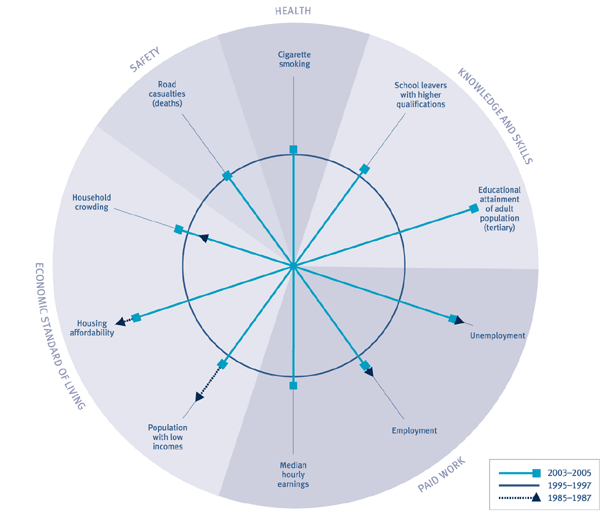
We have data for Pacific peoples dating back to the mid-1980s for two indicators in the Paid Work domain and three indicators in the Economic Standard of Living domain. These, and the remaining indicators dating from the 1990s, show there have been improvements in outcomes for Pacific peoples, but their outcomes are still relatively poor against the large majority of indicators. In some cases, outcomes are worse than they were 20 years ago.
In 1986, the unemployment rate for Pacific peoples was 6.6 percent. By 1992 it had risen to 28 percent, the highest rate for any ethnic group. By 2005, following a steady decline since the early-1990s, it had fallen to 6.1 percent. Employment rates for Pacific peoples fell steeply from 68.4 percent in 1986 to 46 percent in 1992. They have recovered strongly since then. However, with an employment rate of 61.8 percent in 2005, Pacific peoples are still less likely to be employed than they were in 1986.
The proportion of Pacific families with low incomes rose from 23 percent in 1988 to 50 percent in 1993. Their position had improved to 40 percent in 2003/2004, but was still double that of the total population. The proportion of Pacific families who spend more than 30 percent of their income on housing costs increased dramatically from 15 percent in 1988 to 48 percent in 1997, fell to 41 percent in 1998 and 2001, then almost halved to 23 percent in 2004. Household crowding has improved since 1986, but Pacific peoples are still more likely than other ethnic groups to be living in crowded houses.98
There has been a big increase in the proportion of Pacific school leavers with higher qualifications (from 52 percent in 1991 to 61 percent in 2004). Although Pacific adults are less likely than European adults to have higher qualifications, the growth in the proportion of adults with at least upper secondary qualifications was faster for Pacific peoples than for Europeans. The proportion of Pacific peoples who smoke cigarettes has fallen from 32 percent in 1990 to 29 percent in 2004, after fluctuating between 30 and 35 percent during the 1990s and early 2000s.99, 100 Pacific peoples have the second highest rate of workplace injury claims and the second highest rate of death from motor vehicle accidents.
Figure CO3 Changes in social wellbeing for Pacific peoples

Interpreting "Changes in social wellbeing for Pacific peoples"
The circle  represents average outcomes for Pacific peoples against each indicator between 1995 and 1997. The spokes represents average outcomes for Pacific peoples against each indicator between 1995 and 1997. The spokes  represent the most recent performance averaged, where possible, over the most recent three years. Where a spoke falls outside the circle, this means outcomes for Pacific peoples are better now than they were in the mid-1990s; the further from the circle, the greater the improvement. Where a spoke falls inside the circle, outcomes for Pacific peoples are worse now than they were in the mid-1990s; the further the spoke is from the circle the more pronounced this effect. The triangles represent the most recent performance averaged, where possible, over the most recent three years. Where a spoke falls outside the circle, this means outcomes for Pacific peoples are better now than they were in the mid-1990s; the further from the circle, the greater the improvement. Where a spoke falls inside the circle, outcomes for Pacific peoples are worse now than they were in the mid-1990s; the further the spoke is from the circle the more pronounced this effect. The triangles  on the spokes show outcomes for Pacific peoples for the mid-1980s. Where the triangle is closer to the centre of the circle than the end of the spoke, outcomes are better now than they were in the mid-1980s. Where the triangle is further away from the centre of the circle than the end of the spoke, outcomes are worse now than they were in the mid-1980s. There are, however, some important limitations on this style of presentation. In particular, we cannot directly compare the size of changes for different indicators. on the spokes show outcomes for Pacific peoples for the mid-1980s. Where the triangle is closer to the centre of the circle than the end of the spoke, outcomes are better now than they were in the mid-1980s. Where the triangle is further away from the centre of the circle than the end of the spoke, outcomes are worse now than they were in the mid-1980s. There are, however, some important limitations on this style of presentation. In particular, we cannot directly compare the size of changes for different indicators.
Other ethnicities
Ethnicities other than European, Māori and Pacific peoples are referred to as Other. The limited number of indicators for this ethnic group show a mixed picture. Very few of these indicators date back to the 1980s. This and the fact the composition of this group has changed over the last 20 years, makes it difficult to compare outcomes over time.
This ethnic group had the second highest rate of employment in the mid-1980s
(72 percent), but since the mid-1990s this group (partly through the inclusion
of foreign students studying in New Zealand ) has had the lowest rate of employment
of any ethnic group. In 2005, the group’s rate was 59 percent, almost 3 percent
lower than that for Pacific peoples and over 20 percent lower than
that for Europeans. Their unemployment rate was the second lowest behind
Europeans
in
1986, at 4 percent. In 2005, at 6.4 percent, it was lower than that for Māori, but higher than the rate for Pacific peoples and Europeans. Median hourly
earnings are the same as for Māori, but lower than for Europeans. Over the last eight years, employees in the
Other ethnic group have experienced the lowest increase in real median hourly
earnings.
Families with an adult of Other ethnicity was the only group to experience an increase in the proportion of people with low incomes and an increase in the proportion of people spending more than 30 percent of their income on housing between 2001 and 2004. Outcomes for this group are now worse for these two indicators than for any other ethnic group. However, the Other ethnic group performs well across the social connectedness indicators.
Women and Men
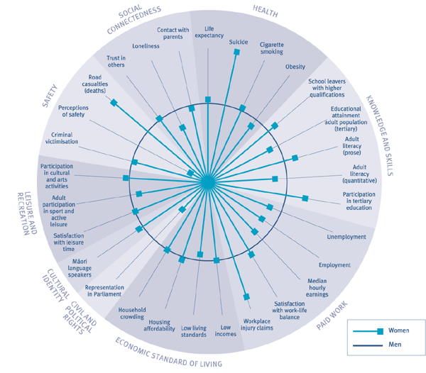
The patterns of change in the Health domain over the last 20 years have been similar for both sexes, with improvements in life expectancy and cigarette smoking rates, a rise then fall in suicide rates, and a deterioration in obesity levels. Between 1985–1987 and 2003–2005, the gap in life expectancy between females and males reduced from 6 to 4.2 years. Over a similar period, the proportion of men smoking cigarettes fell from 30 to 24 percent and the proportion of women smoking fell from 30 to 22 percent. The prevalence of obesity increased between 1989 and 2003 from 10 to 20 percent for males and from 13 to 22 percent for females. Suicide rates for males and females increased between 1986 and 1998, rising from 6.1 per 100,000 population for females, and 17 per 100,000 population for males to 6.5 and 22.3 respectively. However, while the rate for males has dropped steadily since the late-1990s to reach 16.9 per 100,000 in 2003, the rate for females has fluctuated, dropping to 4 in 2000 but increasing again to 6.2 in 2003.
Female outcomes in the Knowledge and Skills domain are now generally better than those for men. Females are more likely than males to leave school with a qualification higher than NCEA Level 1. Since 1986, the proportion of school leavers with higher qualifications has improved at a faster rate for females than for males. In 1986, 45 percent of male school leavers and 48 percent of female school leavers had higher qualifications. In 2004, the proportions had increased to 65 percent for males and 73 percent for females. While women in the 25–34 years age group are more likely than men to have a higher educational qualification, in older age groups men are more likely than women to have higher qualifications. Male participation in tertiary education has increased from 7 percent in 1994 to 10 percent in 2005. Over the same period, female participation has increased from 7 percent to 12 percent.
Figure CO4 Social wellbeing for women, relative to men, 2003–2005

Interpreting "Social wellbeing for women, relative to men"
The circle  represents average outcomes for men over the most recent period for
which we have data, averaged where possible over the last three years. The
spokes represents average outcomes for men over the most recent period for
which we have data, averaged where possible over the last three years. The
spokes  represent the most recent performance for women, averaged, where possible,
over the most recent three years. A spoke falling outside the circle means
the outcome is better for women than for men; the further from the circle,
the greater the difference in that outcome for women compared with men. A spoke
falling inside the circle means the outcome is worse for women than for men;
the further the spoke is from the circle the more pronounced this effect. There
are, however, some important limitations on this style of presentation. In
particular, we cannot directly compare the size of difference in outcomes for
men and women across different indicators. represent the most recent performance for women, averaged, where possible,
over the most recent three years. A spoke falling outside the circle means
the outcome is better for women than for men; the further from the circle,
the greater the difference in that outcome for women compared with men. A spoke
falling inside the circle means the outcome is worse for women than for men;
the further the spoke is from the circle the more pronounced this effect. There
are, however, some important limitations on this style of presentation. In
particular, we cannot directly compare the size of difference in outcomes for
men and women across different indicators.
The gap in outcomes for men and women in the Paid Work domain has narrowed over the last 20 years, but women’s outcomes are still worse than those for men. In 1986, the rate of unemployment for males was 3.6 percent, compared with 4.8 percent for females. While both rates worsened over the next five years, the rate for men deteriorated more than that for women. In 1991, 10.9 percent of males and 9.6 percent of females were unemployed. However, the men’s rate has also recovered more than the women’s rate since then. In 2005, the rate for women was 4 percent compared with 3.4 percent for men.
The gap between men’s and women’s rates of employment has narrowed substantially since the mid-1980s, from 24 to 14 percentage points. In 1986, the rate of employment for men was 84.6 percent compared with 60.2 percent for women. Both men’s and women’s rates of employment dropped through to 1991. While both have improved since then, men’s employment at 81.5 percent in 2005 is lower than it was in 1986. Women’s employment at 68 percent in 2005 is higher than it was in 1986. The lower rates of unemployment and considerably lower rates of employment for women than for men reflect the time women spend on childcare and other unpaid work. Although the part-time rate has almost doubled for men since 1986, women are still more likely to be employed part-time than men.
Women’s median hourly earnings have been consistently lower than men’s. In 2005, women’s median hourly earnings were $15 compared with $17.50 for men.
In the Civil and Political Rights domain, although the number of women in Parliament and in local authorities has improved since the mid-1980s, women are still more poorly represented in political institutions than men. Women now make up 32 percent of all MPs, compared with 13 percent in 1984, and 30 percent of local government board and council members are women, compared with 18 percent in 1986.
|
