| Introduction | | People | | Health | | Knowledge & Skills | | Paid Work | | Economic Standard of Living | | Civil & Political Rights |
| Cultural Identity | | Leisure & Recreation | | Safety | | Social Connectedness | | Life Satisfaction | | Summary | | Notes & References |
DownloadSocial Report 2010 - PDF, 4.71Mb |
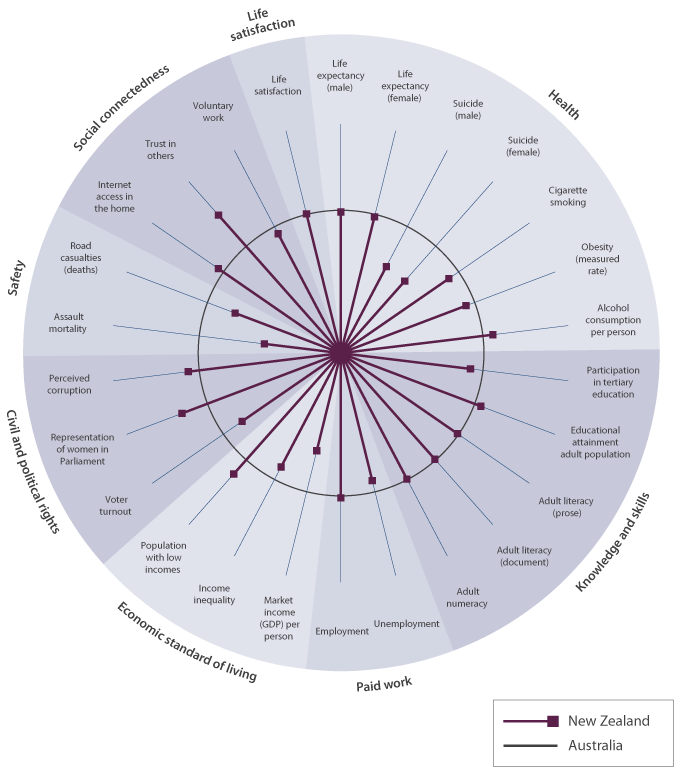
New Zealand compared to AustraliaThe following wheel compares New Zealand outcomes with those of Australia. Figure IC2 Social indicators in New Zealand relative to Australia
Interpreting "Social indicators in New Zealand, relative to Australia"This figure shows New Zealanders’ social wellbeing relative to that of people in Australia for 22 indicators. The circle |